Portfolio Gallery
Logo Design, Redesign and Vectorization Projects
Conscious Design, Tech & Entrepreneurial Studio for Social Media Entrepeneurial Audiences
—Logo Design—
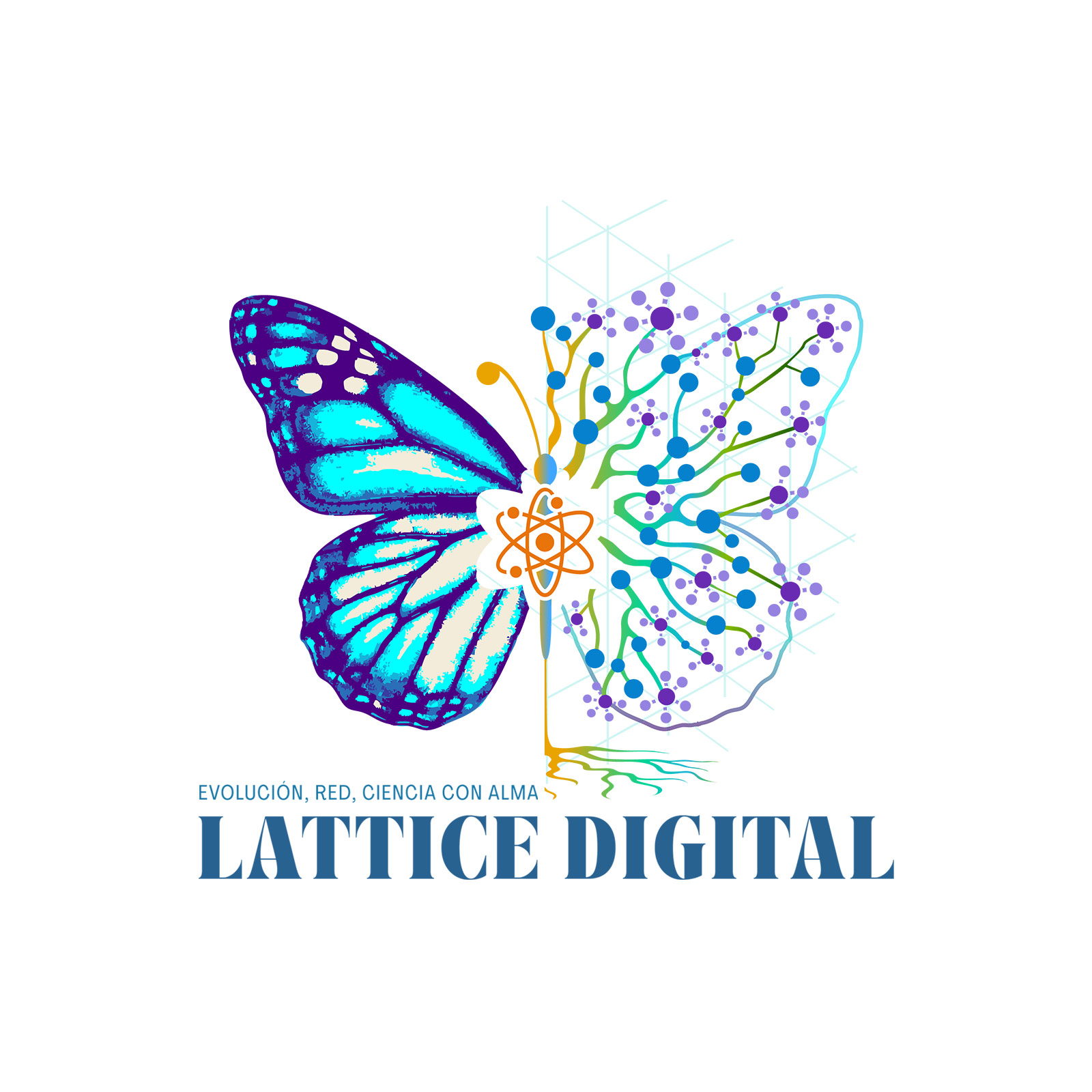
— Developed this logo identity for a venture empowering purpose-driven entrepreneurs through soulful branding, digital tools, and transformational guidance. The brand sits at the intersection of technology, evolution, and conscious science.
The logo uses the metaphor of a butterfly to represent transformation and duality: one wing is organic and vibrant, while the other is structured like a neural network—merging nature with digital intelligence. At the center, an atom radiates outward, grounded by delicate roots that symbolize the fusion of soul, science, and collective knowledge. A palette of blue, cyan, and violet conveys clarity, innovation, and flow. The tagline, “Evolución, Red, Ciencia con Alma” (Evolution, Network, Science with Soul), expresses the brand’s core mission: to bridge data, intelligence, and consciousness through intentional, purpose-driven design.
Responsabilities • Deliverables • Tools & Tech

Se esconde cuando está LIVE
JobTypeID: 6 | Graphic Design
JobType2ID:
ProjectTypeID: 23 | Logo Design
JobType3ID:
JobType4ID:
Healing Affirmations for Emotional Well-being for Social Media Audiences
—Logo Design—
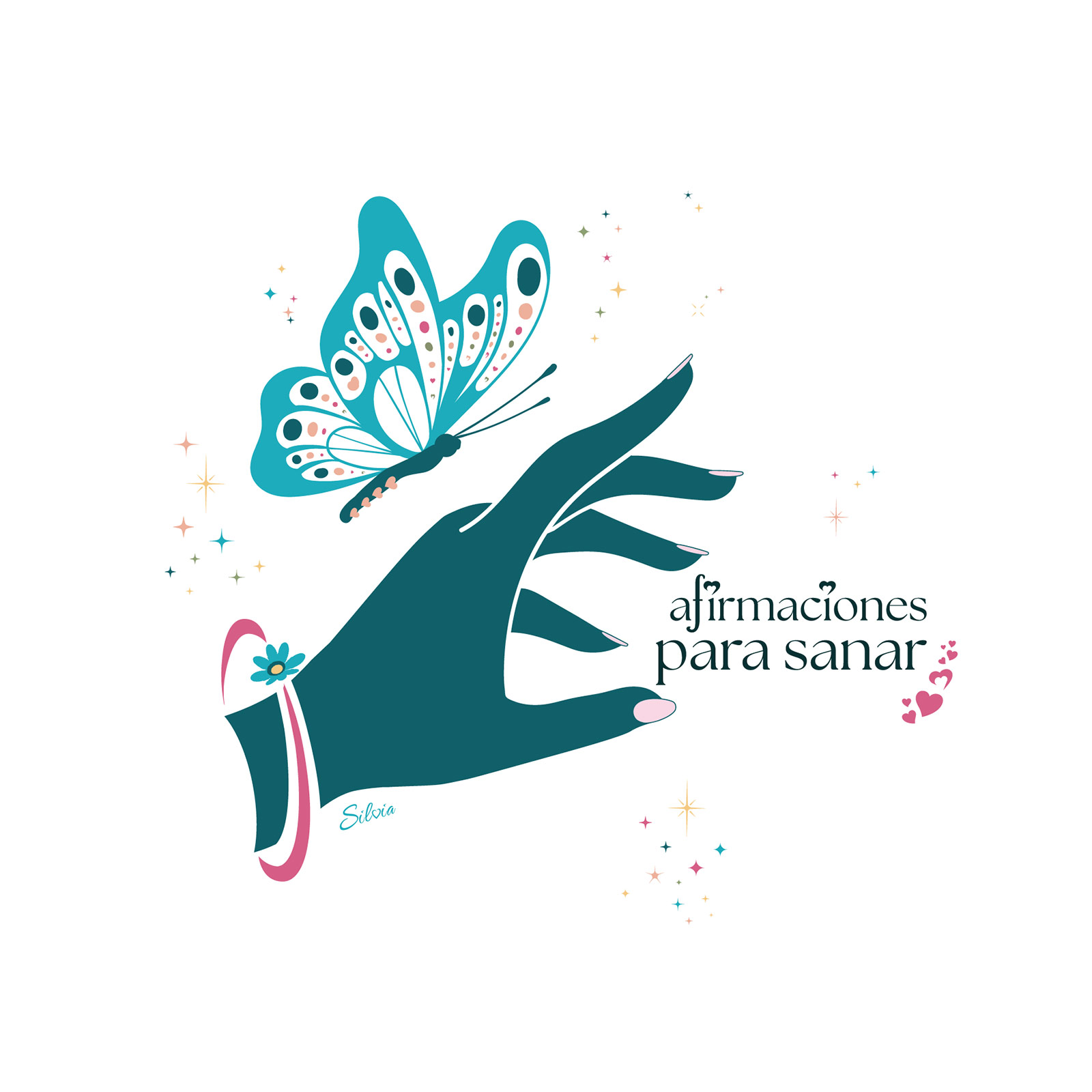
— Designed for a healing-centered project aimed at Spanish-speaking audiences, with a parallel version developed for English-speaking communities. The brand focuses on emotional well-being through intentional affirmations, offering support for inner growth and healing.
The visual features a stylized hand gently releasing a butterfly, symbolizing transformation, emotional release, and the beauty of personal evolution. Surrounding sparkles represent energetic shifts and moments of clarity. Typography details—such as a heart dotting the “i”—add emotional resonance to the brand name. The calming palette of teal, soft pink, and white evokes serenity and warmth, fully aligned with the project’s purpose: to guide people through a gentle journey of healing with conscious language and loving presence.
Responsabilities • Deliverables • Tools & Tech
Se esconde cuando está LIVE
JobTypeID: 6 | Graphic Design
JobType2ID:
ProjectTypeID: 23 | Logo Design
JobType3ID:
JobType4ID:
Foreign Artisan Lifestyle and Gift Brand
—Logo Design—
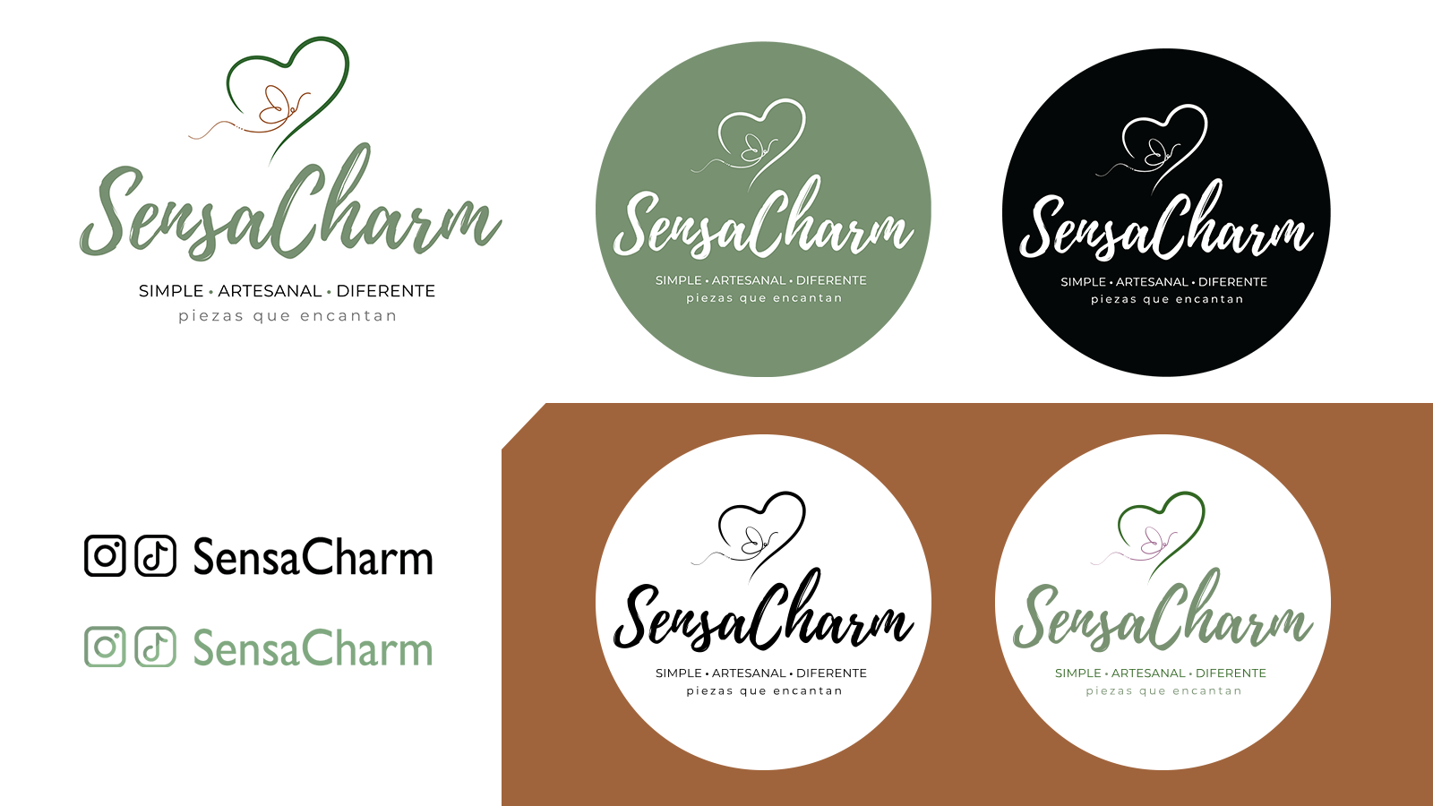
— This identifier was conceptualized and brought to life to express the essence of a brand rooted in simplicity, handmade artistry, and emotional connection. The design features a heart-shaped outline drawn with an organic line, enclosing a delicate butterfly formed with a single thread stroke. This symbolizes transformation and the artisanal care behind each piece.
The brand name SensaCharm appears in a soft brush-style script to convey warmth and individuality. A clean sans-serif tagline — "Simple • Artesanal • Diferente" — anchors the brand’s values, while “piezas que encantan” reinforces its goal of sparking joy. The earthy green and copper palette evokes nature, elegance, and authenticity, reflecting the brand’s commitment to creating meaningful, beautiful pieces.
Responsabilities • Deliverables • Tools & Tech
Se esconde cuando está LIVE
JobTypeID: 6 | Graphic Design
JobType2ID:
ProjectTypeID: 23 | Logo Design
JobType3ID:
JobType4ID:
Language and Cultural Enrichment Tutoring Services
—Logo Design—
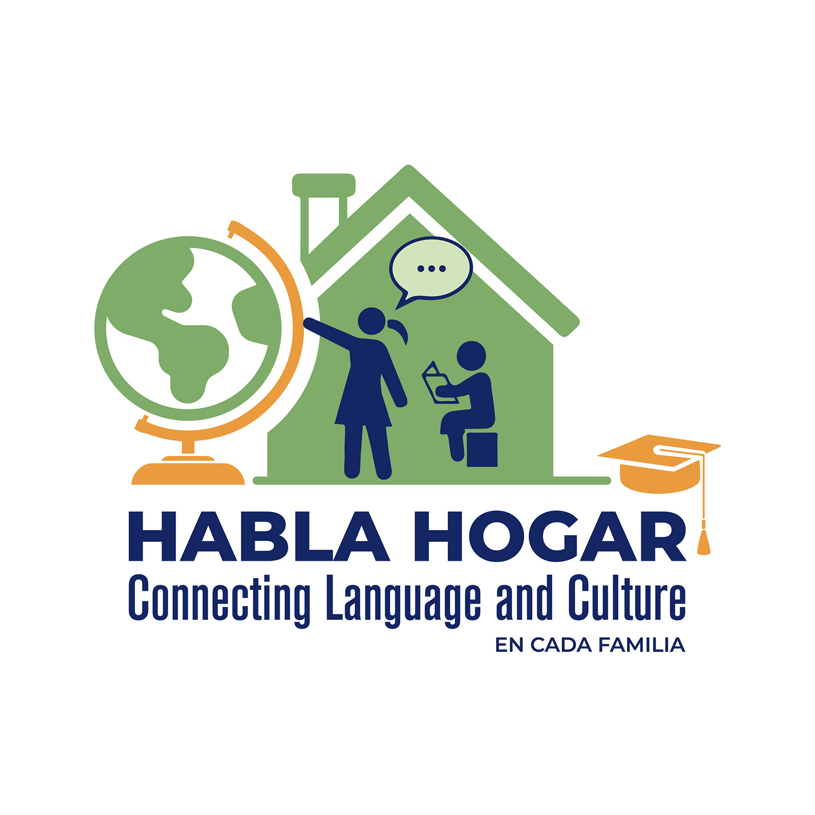
— Logo creation for an educational initiative focused on language learning and cultural connection within immigrant families.
The visual identity integrates the concepts of home, education, and global culture. The house structure frames a learning moment between an adult and a child, symbolizing intergenerational teaching and support. The globe highlights multicultural inclusion, while the graduation cap represents academic progress and aspiration. A color palette of green, navy, and orange conveys growth, trust, and ambition—balancing warmth with clarity. The bilingual tagline, “Connecting Language and Culture – En cada familia,” reinforces the mission of empowering families through cultural awareness and language development.
Responsabilities • Deliverables • Tools & Tech
Se esconde cuando está LIVE
JobTypeID: 6 | Graphic Design
JobType2ID:
ProjectTypeID: 23 | Logo Design
JobType3ID:
JobType4ID:
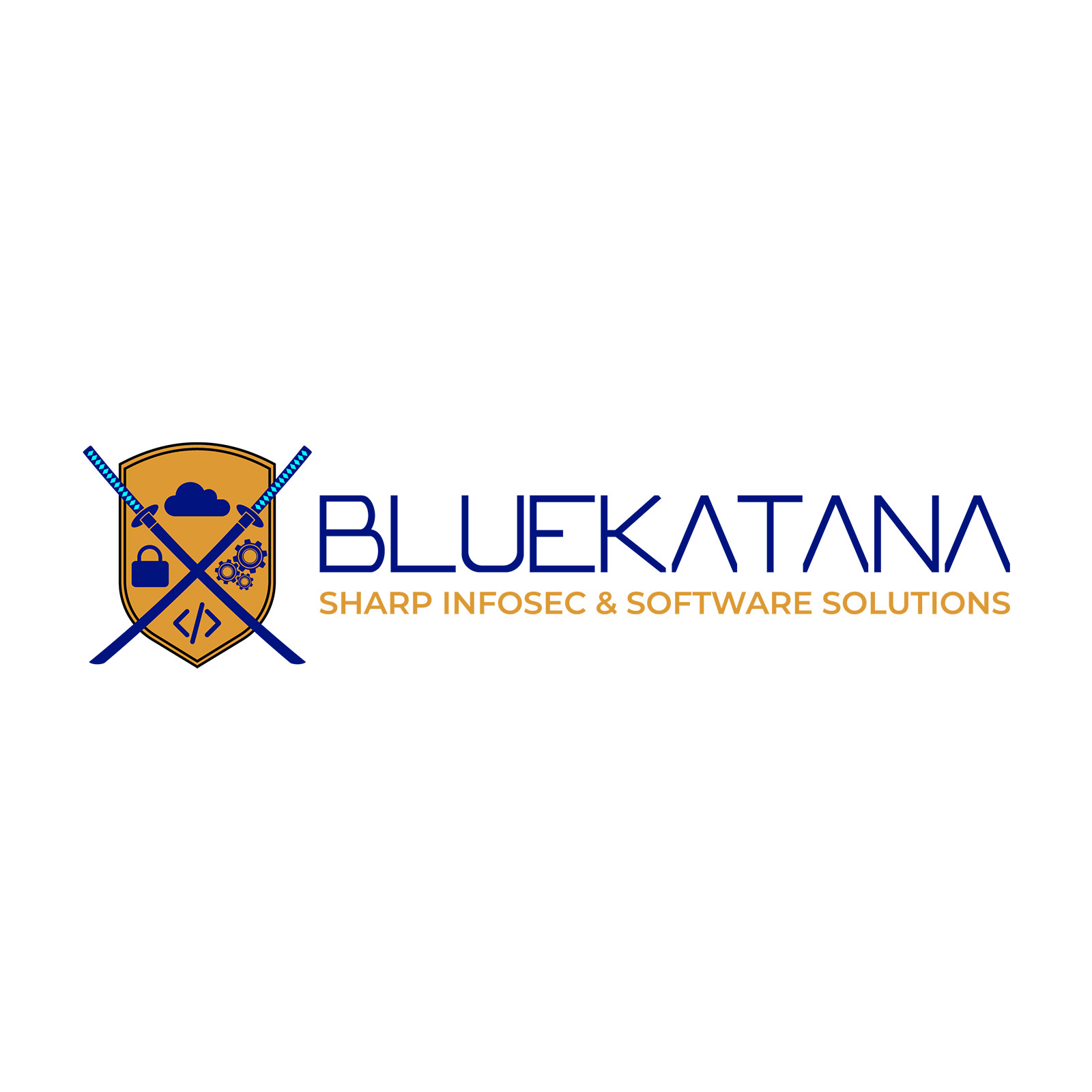
InfoSec and Software Solutions
—Logo Redesign—
— This logo redesign aimed to modernize and clarify the brand identity while preserving its core symbolism.
The updated design features a refined shield crossed by two katana swords, now with cleaner geometry and a balanced layout. Each icon within the shield represents a key pillar of this client services: cloud solutions, cybersecurity, development, and automation. The new typography is minimalist and futuristic, with a precise alignment that reflects the brand technical rigor. Deep blue and golden orange were retained to convey trust, innovation, and excellence. The refreshed visual identity supports BlueKatana positioning as a reliable partner for virtual CISO/CIO services and process automation — as reflected in their current service offerings.
Responsabilities • Deliverables • Tools & Tech
Se esconde cuando está LIVE
JobTypeID: 6 | Graphic Design
JobType2ID:
ProjectTypeID: 62 | Logo Redesign
JobType3ID:
JobType4ID:
Certified Aquatic Safety and Rescue Training Services
—Logo Design—
— This logo was developed as part of the full brand identity and digital presence for Water Rescue EMS, a certified training company founded by Carlos Reyes—an experienced ocean lifeguard, firefighter, and international instructor with over 30 years of service.
The logo integrates key visual elements: the American flag to emphasize certified U.S.-based training standards; stylized waves to reflect dynamic water environments; and a realistic lifebuoy as a central symbol of rescue. The circular badge composition evokes certification and authority, while the bold, legible type ensures visibility across uniforms, print materials, and digital platforms. The visual identity was designed to inspire trust and communicate operational readiness, aligning with the company’s commitment to high standards in emergency aquatic response and training.
Responsabilities • Deliverables • Tools & Tech
Se esconde cuando está LIVE
JobTypeID: 6 | Graphic Design
JobType2ID:
ProjectTypeID: 23 | Logo Design
JobType3ID:
JobType4ID:
Conscious Branding and Mentorship Services for Wellness Entrepreneurs
—Logo Design—
— This bilingual brand supports purpose-driven entrepreneurs in the holistic and wellness space by merging strategic branding with coaching and mentorship. Through Paseo Holístico (Spanish) and Holistic Ride (English), I offer tools to help clients shape, ground, and ethically promote their offerings.
The logo represents a blooming tree growing from a meditative human figure, symbolizing personal transformation, growth, and alignment. The lotus elements reflect serenity, while the abstract splash shape evokes creativity and expansion. The tagline “Disfruta el viaje / Enjoy the journey” reinforces the idea of embracing the process, both in life and in entrepreneurship. Both logos were created to support digital and printed assets, maintaining visual consistency across languages while honoring cultural nuances.
Responsabilities • Deliverables • Tools & Tech
Se esconde cuando está LIVE
JobTypeID: 6 | Graphic Design
JobType2ID:
ProjectTypeID: 23 | Logo Design
JobType3ID:
JobType4ID:
Latinamerican Life & Spiritual Coach
—Logo Design—
— This logo was designed for Carolina Torres, a spiritual life coach launching her brand for the Latin American market. The concept originated from a heartfelt drawing created by her young daughter (then 7–8 years old), which we carefully honored and translated into a refined digital identity.
The design integrates the symbol of infinity with angel wings and a heart, expressing the essence of her brand: Amor Infinito Angelical (Infinite Angelic Love). I led the vectorization, refinement, and full asset production, creating multiple versions for use across digital, print, and branding applications to support a meaningful and personal launch.
Responsabilities • Deliverables • Tools & Tech
Se esconde cuando está LIVE
JobTypeID: 6 | Graphic Design
JobType2ID:
ProjectTypeID: 23 | Logo Design
JobType3ID:
JobType4ID:
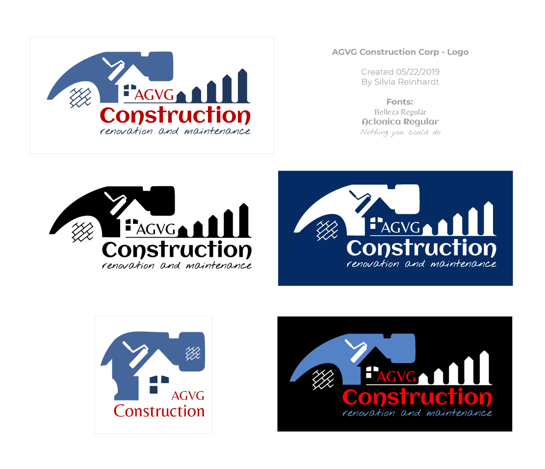
Family-Owned Renovations Business
—Logo Design—
— I collaborated with AGVG Construction, a family-owned company specializing in renovation, maintenance, and construction, providing freelance support over several months. My role included brand conceptualization, logo design, creation of marketing collateral, and assistance in organizing internal admin processes.
The logo blends key visual elements—a hammer, roofline, tile pattern, and rising bar structure—to represent the company's scope: from hands-on work to structural improvement and business growth. The design was delivered in multiple color variants and formats to ensure versatility across uniforms, signage, invoices, and digital channels.
Responsabilities • Deliverables • Tools & Tech
Se esconde cuando está LIVE
JobTypeID: 6 | Graphic Design
JobType2ID:
ProjectTypeID: 23 | Logo Design
JobType3ID:
JobType4ID:
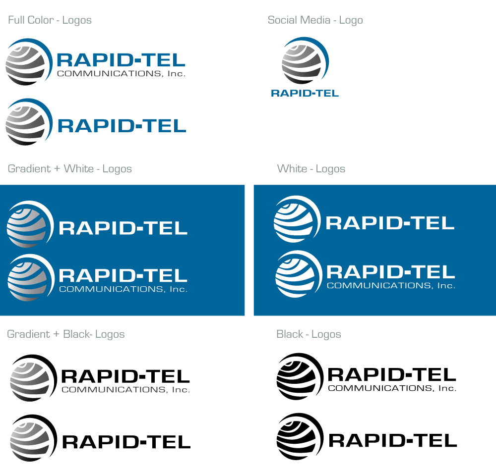
Survilliance and Telecommunications Services
—Logo Vectorization—
— The client provided an old, worn business card featuring a deteriorated version of their logo. My task was to digitally recreate and vectorize the original design with precision, ensuring brand consistency. I delivered a full logo asset set, including the formal gradient version, flat color variations, favicon, avatar/icon adaptations, and usage guidelines. This updated brand package enabled the client to use the logo confidently across print and digital media with proper format support.
Responsabilities • Deliverables • Tools & Tech
Se esconde cuando está LIVE
JobTypeID: 6 | Graphic Design
JobType2ID:
ProjectTypeID: 63 | Logo Vectorization
JobType3ID:
JobType4ID:
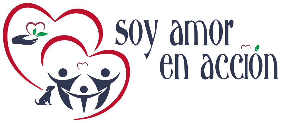
Motivational and Inspirational Blog
—Logo Design—
— I developed this logo for a nonprofit initiative supporting Spanish-speaking communities across the U.S. and Latin America. The design centers on two interlinked hearts containing stylized human figures, symbolizing unity, protection, and collective joy. A small pet and an extended hand offering a sprouting heart reinforce inclusivity and the spirit of giving.
The typography is warm and expressive, with thoughtful graphic accents like the heart above the “ó” and the sprout on the “i,” connecting the visual and verbal message. The color palette—red, navy, and green—reflects compassion, trust, and renewal. Designed for both digital and print, the logo anchors a brand rooted in love, collaboration, and action.
Responsabilities • Deliverables • Tools & Tech
Se esconde cuando está LIVE
JobTypeID: 6 | Graphic Design
JobType2ID:
ProjectTypeID: 23 | Logo Design
JobType3ID:
JobType4ID:
Digital Content Strategy Services
—Logo Design—
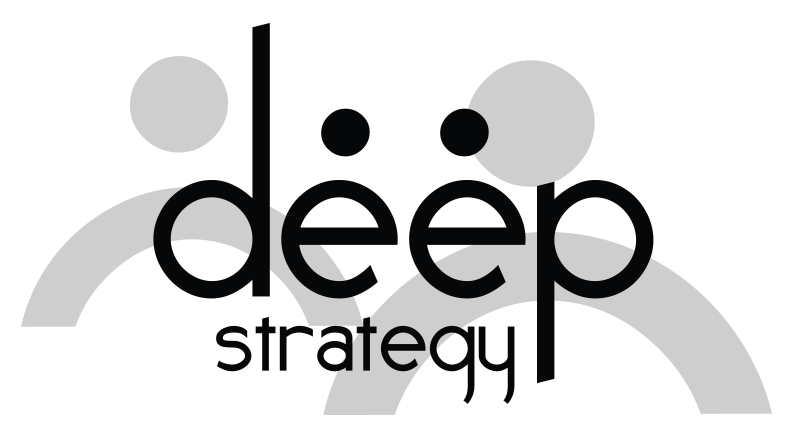
— This logo was created for a digital content strategy company, with a focus on clarity, connection, and collaboration. The design leverages custom typography where the mirrored "e" letters form abstract human figures in dialogue, visually reinforcing the brand's emphasis on communication and strategic alignment. The clean, modern lines convey professionalism, while the subtle human shapes in the background suggest a collaborative team dynamic. The overall composition balances structure and creativity—key values for a brand that guides others through impactful digital storytelling.
Responsabilities • Deliverables • Tools & Tech
Se esconde cuando está LIVE
JobTypeID: 6 | Graphic Design
JobType2ID:
ProjectTypeID: 23 | Logo Design
JobType3ID:
JobType4ID:
Foreign Real Estate
—Logo Design—
— I led the full brand development for a foreign real estate venture based in the internationally recognized region of Traslasierra. My scope included naming, logo design, and creative direction to support the foundation of a business dedicated to both property development and resale.
The logo concept merges a house and magnifying glass to reflect property search and trust. I delivered multiple logo variants—including horizontal and stackable versions—to ensure adaptability across a wide range of applications: signage, collateral, digital campaigns, and printed media. The design system balances bold visibility with versatility for real estate communication.
Responsabilities • Deliverables • Tools & Tech
Se esconde cuando está LIVE
JobTypeID: 6 | Graphic Design
JobType2ID:
ProjectTypeID: 23 | Logo Design
JobType3ID:
JobType4ID:
Motion Detection Technology Reseller
—Logo Design—
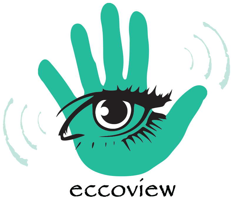
— This logo was created for a tech startup focused on motion detection solutions. The design concept merges a stylized hand and eye to symbolize both sensing and vision—two core aspects of motion detection technology. The radiating lines emphasize signal responsiveness, while the bold, organic shapes evoke precision, awareness, and human-centered innovation.
Responsabilities • Deliverables • Tools & Tech
Se esconde cuando está LIVE
JobTypeID: 6 | Graphic Design
JobType2ID:
ProjectTypeID: 23 | Logo Design
JobType3ID:
JobType4ID:
Home Renovation Advisors Directory
—Logo Design—
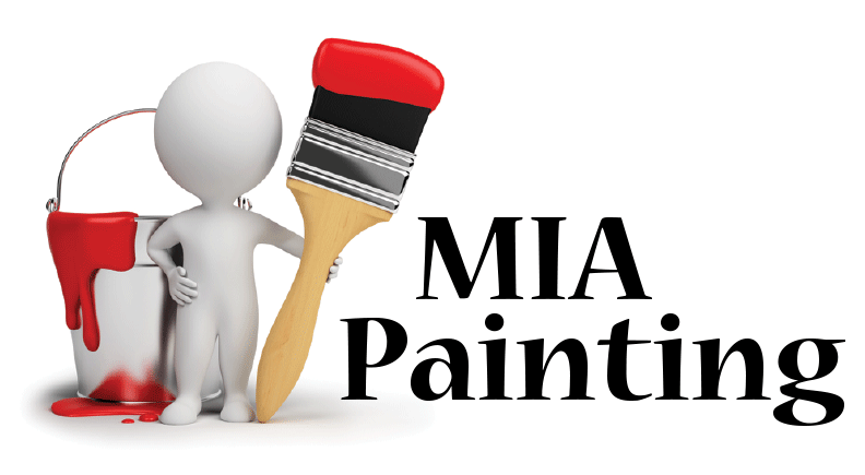
— This logo was developed for a South Florida-based startup serving as a directory for painting services within the home renovation industry. The design combines a clear, approachable visual—featuring a 3D figure holding a brush and paint bucket—with bold, professional typography to convey reliability and service-oriented identity. It visually reflects both hands-on craftsmanship and the platform’s role as a connector between homeowners and renovation professionals.
Responsabilities • Deliverables • Tools & Tech
Se esconde cuando está LIVE
JobTypeID: 6 | Graphic Design
JobType2ID:
ProjectTypeID: 23 | Logo Design
JobType3ID:
JobType4ID:
Commercial Real Estate Consulting Logo
—Logo Design—
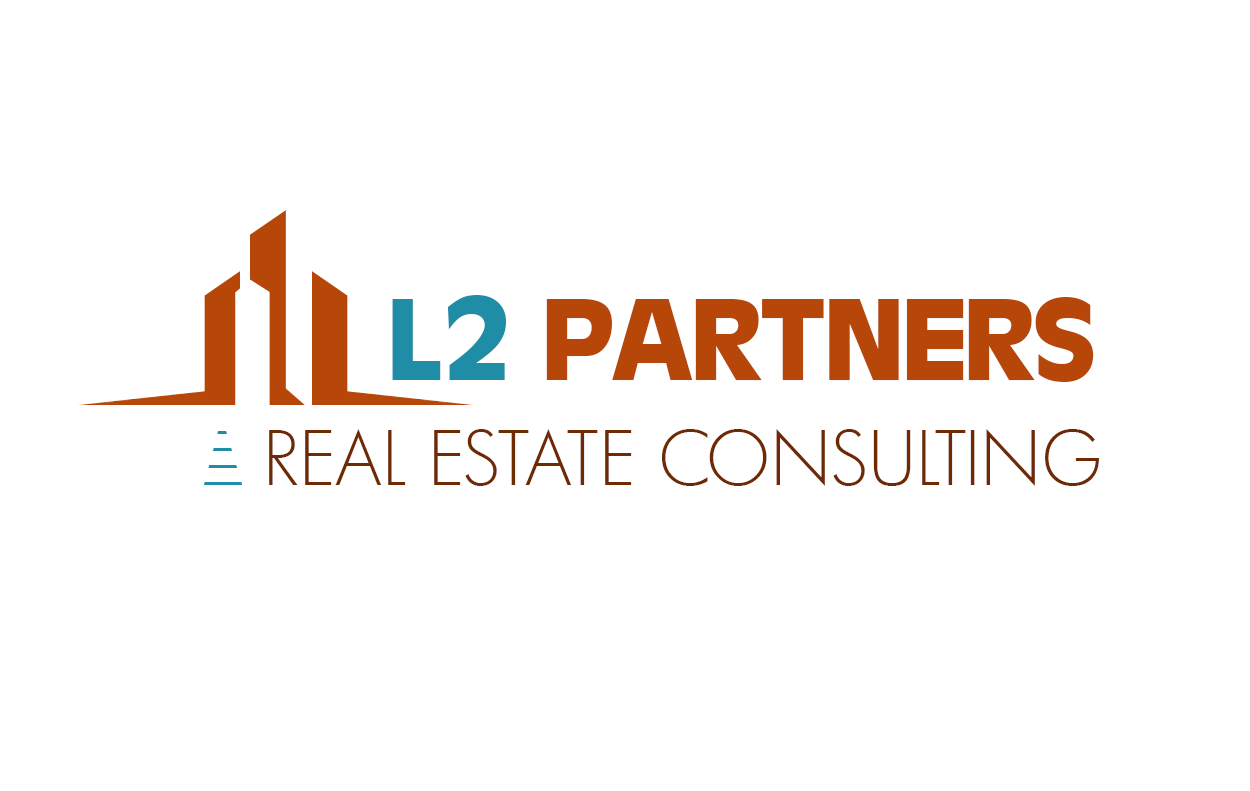
— I was commissioned as a freelance designer to develop the brand identity and visual assets for L2 Partners, a newly established commercial real estate consultancy in South Florida. The founder—formerly my supervisor at a marketing agency where I worked for nearly eight years—entrusted me with the full creative direction. I conceptualized the logo, brandmark, and visual system, including favicon, color and typography guidelines, and web-ready assets. The visual identity strikes a balance between professionalism and approachability, reflecting the firm’s commitment to clarity and strategic vision in the real estate market.
Responsabilities • Deliverables • Tools & Tech
Se esconde cuando está LIVE
JobTypeID: 6 | Graphic Design
JobType2ID:
ProjectTypeID: 23 | Logo Design
JobType3ID:
JobType4ID:
Duty Free Travel Retailer Online Shopping Logo
—Logo Design—
— As part of my multi-year collaboration with Duty Free Americas, I led the brand identity design for their first-ever online retail initiative: DFA Express. This project involved a full reconceptualization of the corporate logo, introducing a dynamic sub-brand that communicated speed, accessibility, and global travel. The stopwatch and forward-slanted typography symbolize urgency and efficiency—key traits of the express shopping experience.
Beyond the logo itself, I developed the visual foundation for an expansive brand rollout, including collateral such as brochures, airport posters, shopping bags, digital signage, and looped video displays. The pilot program was launched in over 11 retail locations at Miami International Airport, marking a milestone in the company’s shift toward integrated, omnichannel commerce.
Responsabilities • Deliverables • Tools & Tech
Se esconde cuando está LIVE
JobTypeID: 6 | Graphic Design
JobType2ID:
ProjectTypeID: 23 | Logo Design
JobType3ID:
JobType4ID:
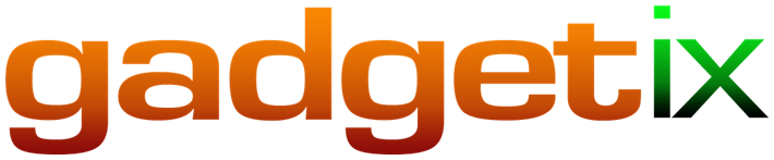
Technology and Gadgets Blog
—Logo Vectorization—
— Gadgetix was a brand developed for a tech-savvy writer under the umbrella of Blue Katana, a company I regularly collaborated with. My role involved vectorizing the client’s original concept, defining a cohesive color scheme, and preparing final assets optimized for digital implementation. The result was a clean, vibrant logo suitable for use across blog platforms and related media.
Responsabilities • Deliverables • Tools & Tech
Se esconde cuando está LIVE
JobTypeID: 6 | Graphic Design
JobType2ID:
ProjectTypeID: 63 | Logo Vectorization
JobType3ID:
JobType4ID:
Freelance Digital Design Atelier
—Logo Design—
— rgbConcept is the personal brand I created to represent my freelance design services, combining visual identity, digital marketing, and conceptual design under a unified, flexible studio name. I developed the full logo system and asset package, including responsive variations for digital and print applications.
The logo blends the precision of digital work with the creativity of an atelier. The use of primary RGB color dots evokes screen-based work, while the playful typography and geometric framing suggest both structure and fluidity. The juxtaposition of serif and bold sans-serif fonts reflects the balance between conceptual thinking and execution—branding, communication, and production unified under one clear identity.
Responsabilities • Deliverables • Tools & Tech
Se esconde cuando está LIVE
JobTypeID: 6 | Graphic Design
JobType2ID:
ProjectTypeID: 23 | Logo Design
JobType3ID:
JobType4ID:
Royal Caribbean Group's Cruise Flight Booking Platform
—Logo Design—
— Official logo created for ChoiceAir, the flight booking platform connecting cruise guests with flights aligned to their itineraries across Royal Caribbean Group brands. The icon blends an airplane and cruise ship to symbolize the seamless transition between air and sea travel. The logo was delivered in four brand-specific variants, each highlighting the word Air in a color aligned with its respective brand: Royal Caribbean, Celebrity Cruises, Samara, and a unified global version (as shown) representing the umbrella identity across all three.
The design reflects clarity, motion, and trust, using clean typography and color contrast to distinguish the air travel component within the cruise ecosystem.
Responsabilities • Deliverables • Tools & Tech
Se esconde cuando está LIVE
JobTypeID: 6 | Graphic Design
JobType2ID:
ProjectTypeID: 23 | Logo Design
JobType3ID:
JobType4ID:
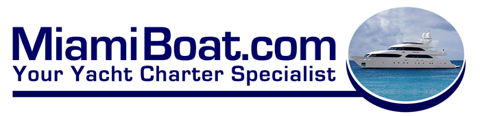
Yacht Charter Services
—Logo Redesign—
— This redesign was part of a larger visual identity refresh for one of the partner ventures under the Miami Lodge Realty umbrella. The brand concept was already established, and my role focused on refining the presentation and delivering high-resolution assets for consistent use across various brand collateral. The final output supported their expansion into printed materials and digital campaigns.
Responsabilities • Deliverables • Tools & Tech
Se esconde cuando está LIVE
JobTypeID: 6 | Graphic Design
JobType2ID:
ProjectTypeID: 62 | Logo Redesign
JobType3ID:
JobType4ID:
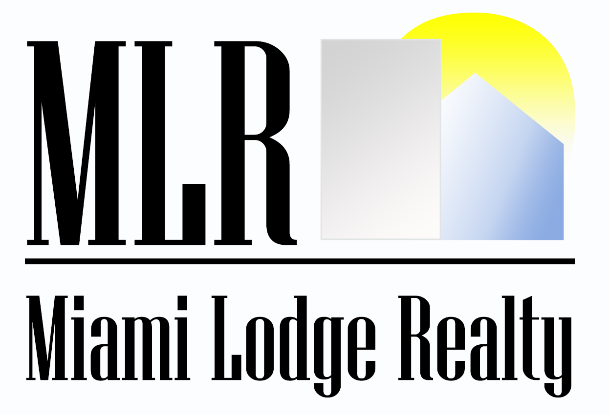
Real Estate Logo
—Logo Design—
— As part of a broader branding initiative, I was brought in to support multiple partners of a vacation rental company operating across five countries. The goal was to unify their offerings under a new corporate real estate branch. I led the conceptualization of the brand identity, working across multilingual websites and regional contexts. This logo represents the launch of their corporate real estate division, combining strong typographic presence with a clean visual metaphor of property, structure, and sunlight—symbolizing growth, stability, and clarity.
Responsabilities • Deliverables • Tools & Tech
Se esconde cuando está LIVE
JobTypeID: 6 | Graphic Design
JobType2ID:
ProjectTypeID: 23 | Logo Design
JobType3ID:
JobType4ID: